Case Closed
2026
Brand Strategy
Logo & Identity
Sub-brand System
Character Design
Art Direction
App Design
UI/UX Design
Motion Design
Shape Generator
Design System
Design Director (Product)
Sam Tipikin
Creative Director
Roman Myronov
Motion Designer
Roman Danyliuk
UI/UX Designer
Yuliia Lunina
Client, Partner, Friend
Genie Health, Singapore
Brand identity and product design for an AI health guide.
Genie: Brand Identity & Product Design for an AI Health Guide
[Problem]
[The Gap]
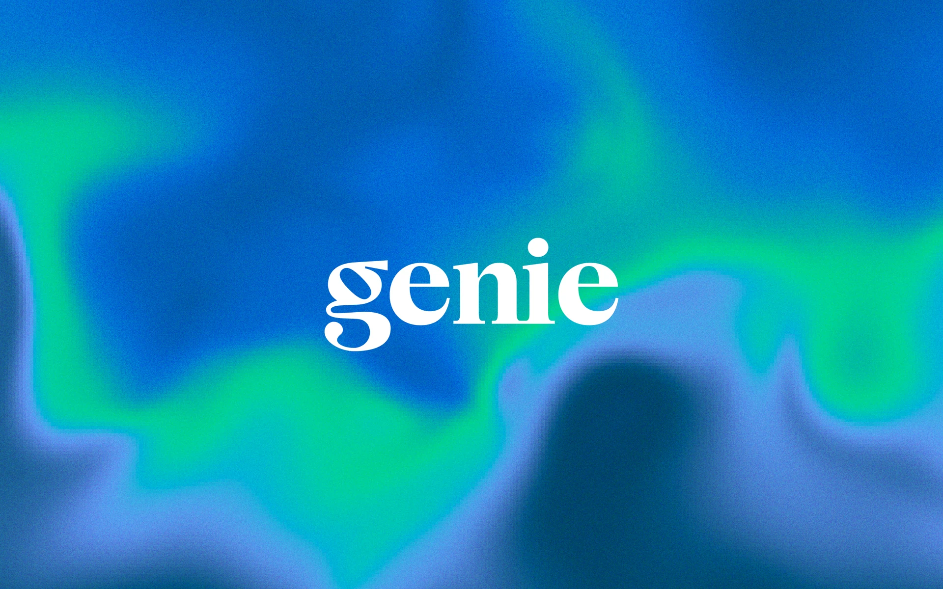
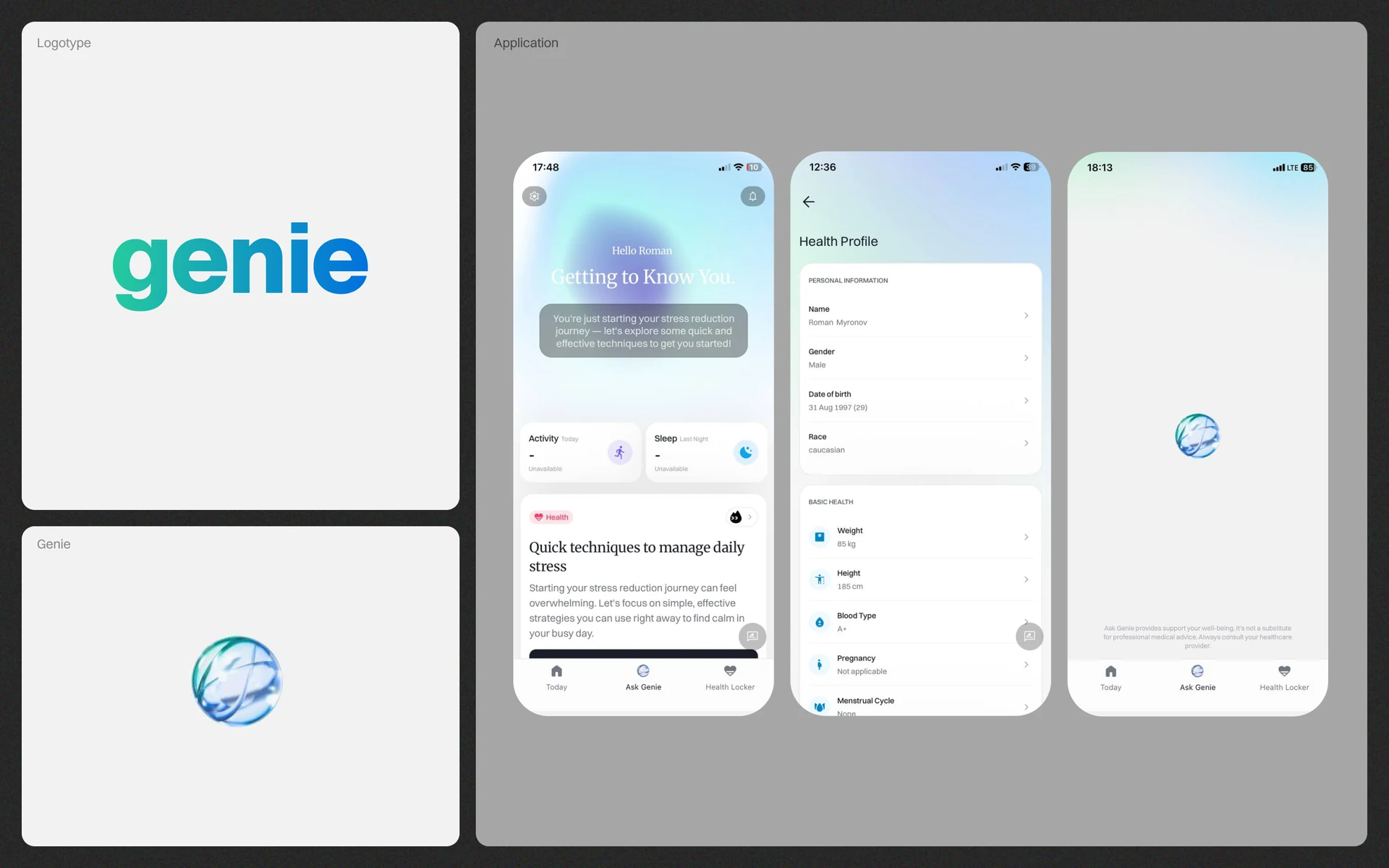
Genie had a product that worked and a brand that was still missing a piece. The app pulled scattered health data into one place and made sense of it, but the experience was purely functional — healthcare blue and green, a generic AI sphere, screens that delivered information without ever suggesting who was delivering it.
The identity had no character yet, and the parts weren't connected: logo, symbol and motion existed separately rather than as a system. In a category people already avoid, that piece matters more than it would anywhere else. How Genie makes someone feel decides whether they open it at all — and that was the layer still to come. Here is how it used to look.
[The Logo]
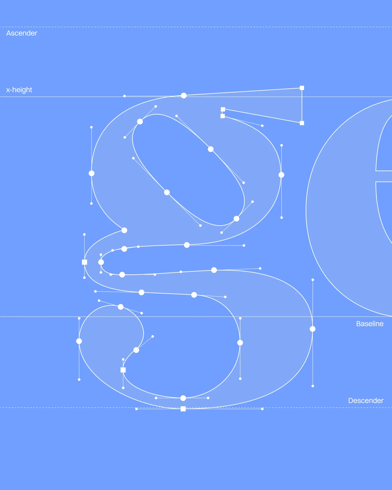
Most marks in health tech look interchangeable, and the old Genie wordmark sat in the middle of that pack. Healthcare also limits how far a brand can move. People trust a health product with their bodies, so the mark had to stay trustworthy. We kept that weight and looked for one detail that would make it recognisable.
The name gave us that detail. A genie is a jinn, and a jinn trails off into smoke. We drew that smoke into the descender of the g, so a single letter carries the story of the name. That order fits a brand whose magic works in the background.
[Sub-brands]
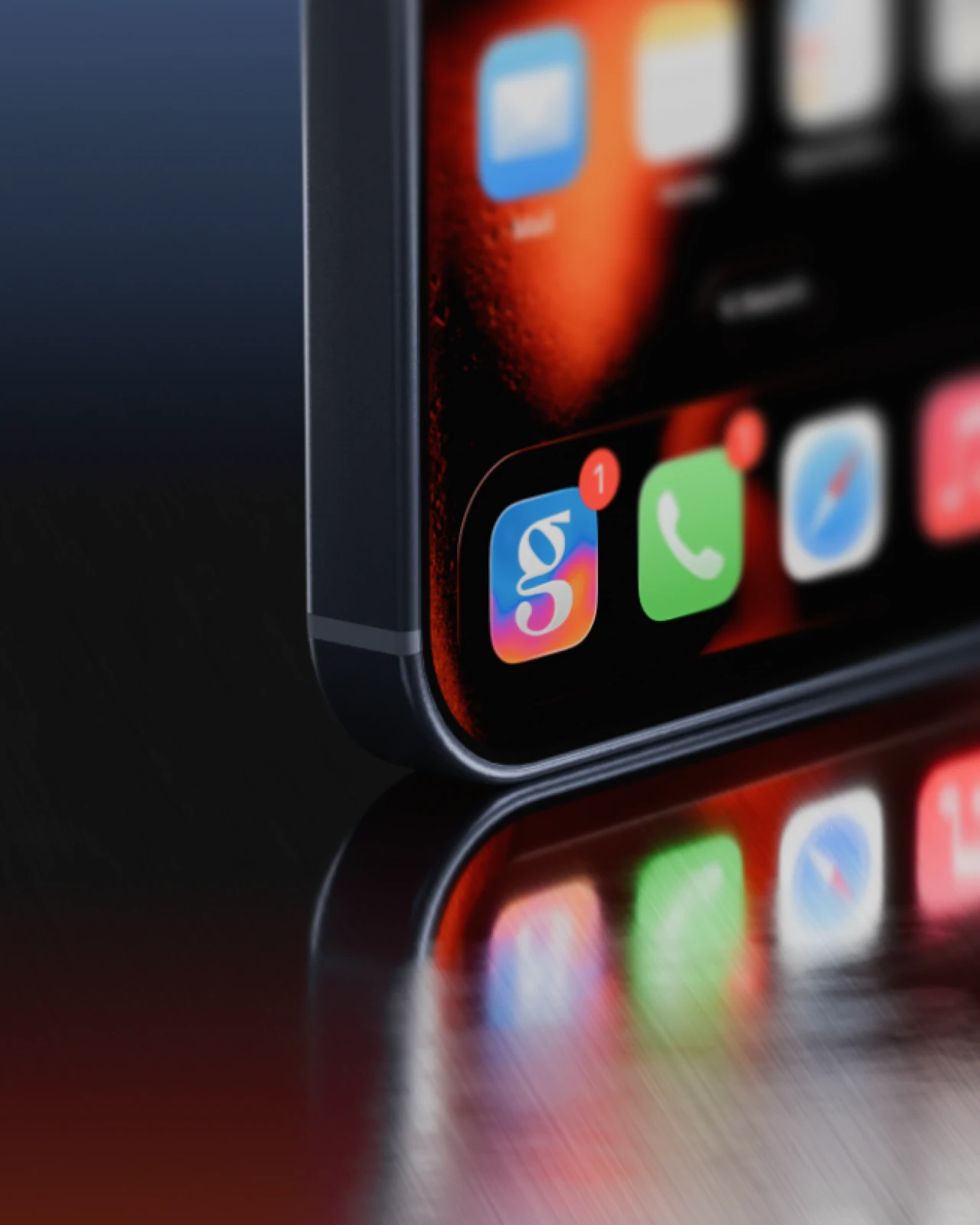
Genie won't stay one product. Rather than hand over a single lockup, we built a derivation framework: a fixed lockup structure and rules for how colour carries across variants, so any sub-brand reads as part of the same family without being redrawn. The team can add products and stay aligned with the master brand without coming back to us.
[Colors + Type]
Genie came to us with a palette, a set of gradients and a serif typeface already in use across their app. They wanted all three kept. Our research raised the problem with that: nearly every healthcare brand runs on blue and green, and Genie's palette sat right among them.
So the brief turned into a question of approach. We couldn't swap the assets, so we had to change how the brand used them. The work that follows shows how we took the client's own colours, gradients and type and built something that stands apart from the category.
[Creative Strategy]
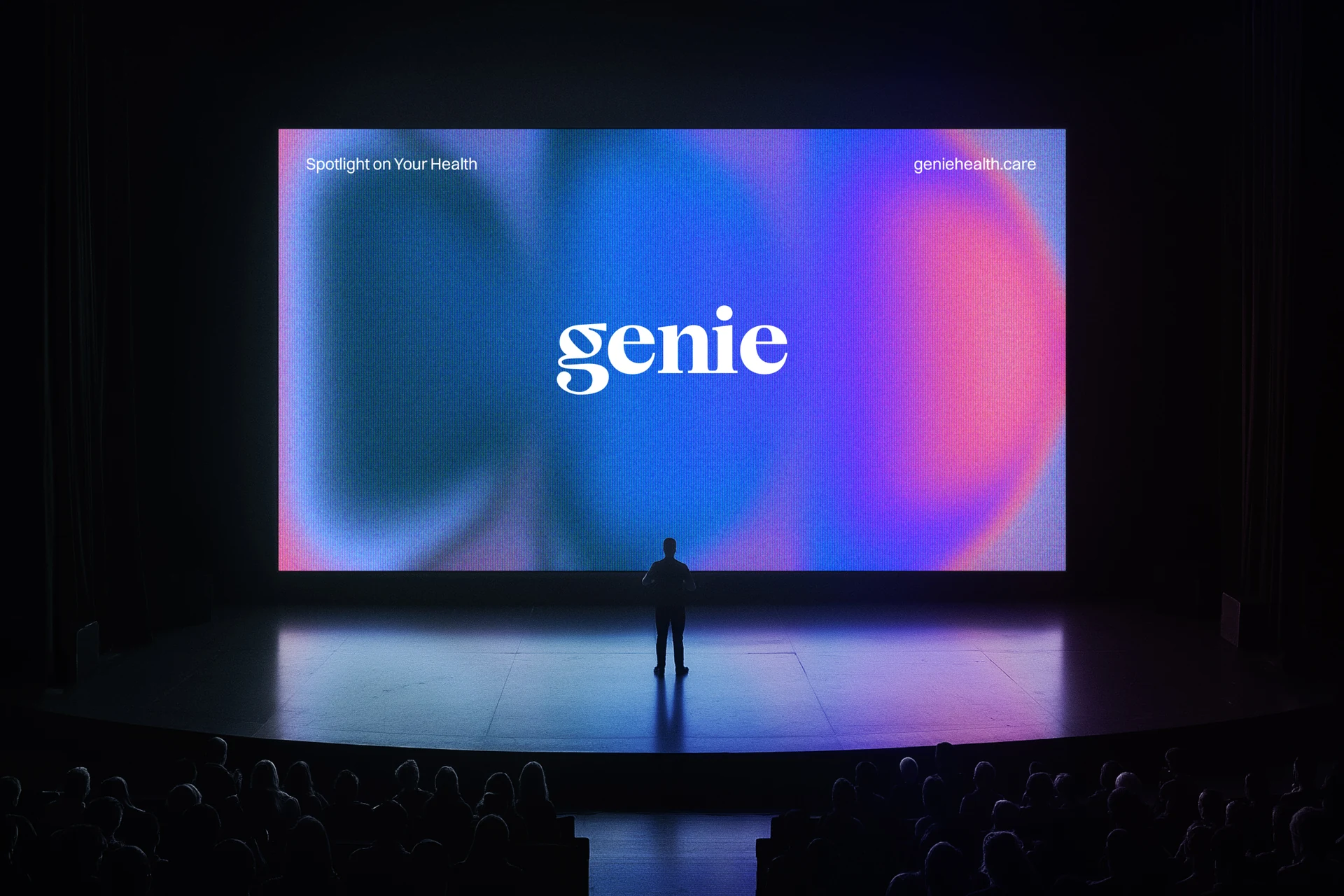
We repositioned Genie as a spotlight: it shows what matters for you right now and leaves the rest in the dark until you need it.
Genie gives each user personalised insights and guidance about their own health. Most health apps present the same information to everyone.
[The Lamp]
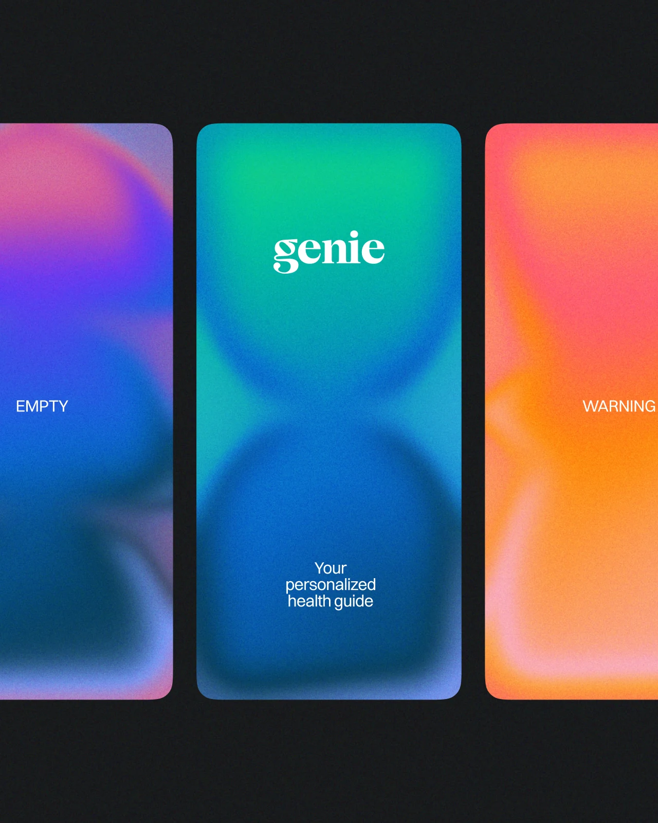
A genie lives in a lamp, and a lamp throws light on one spot. That became the brand's visual metaphor. We based the lamp silhouettes on biological and organic forms, so they sit naturally next to anatomy, body imagery and the client's gradients.
[Shape Generator]
The brand has to keep working after we hand it over. Genie's marketing and product teams will produce new material for years, so we built them a tool that generates brand visuals. It creates lamp shapes and gradient compositions within the system's rules, and the team can make new assets without redrawing anything or coming back to us.
[Beyond the Lamp]
The lamp introduced the idea. The gradient approach behind it goes much further. The same technique can take the form of whatever the context calls for, from an organ to a metric to a person in motion, and still read as Genie. The brand gets one visual language that adapts to the subject instead of a fixed set of symbols.
[The App]
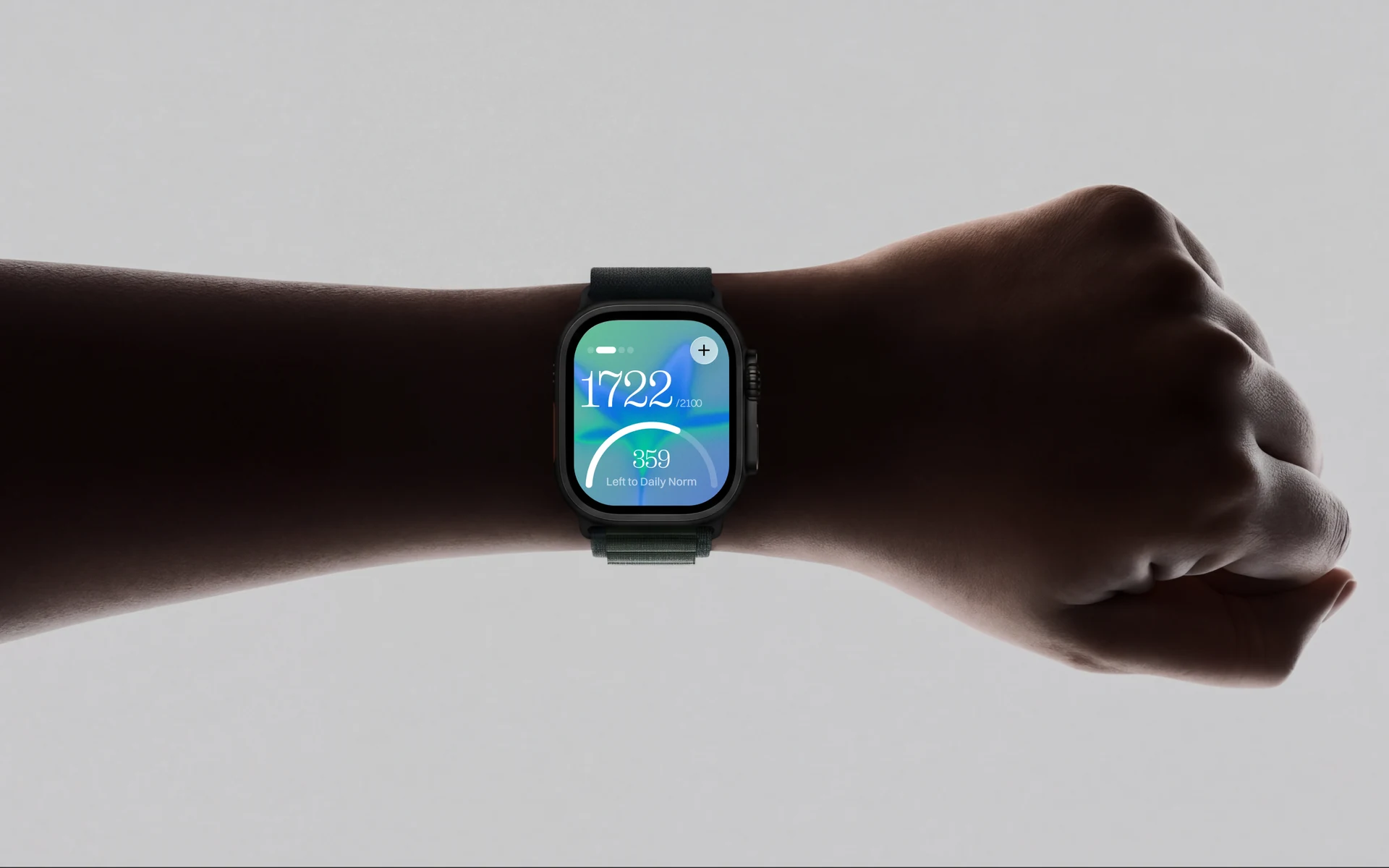
The app is the brand's main home. Here the gradients do real work: each one shapes itself around the data it shows, so the interface carries the same spotlight idea as the rest of the brand.
[Character]
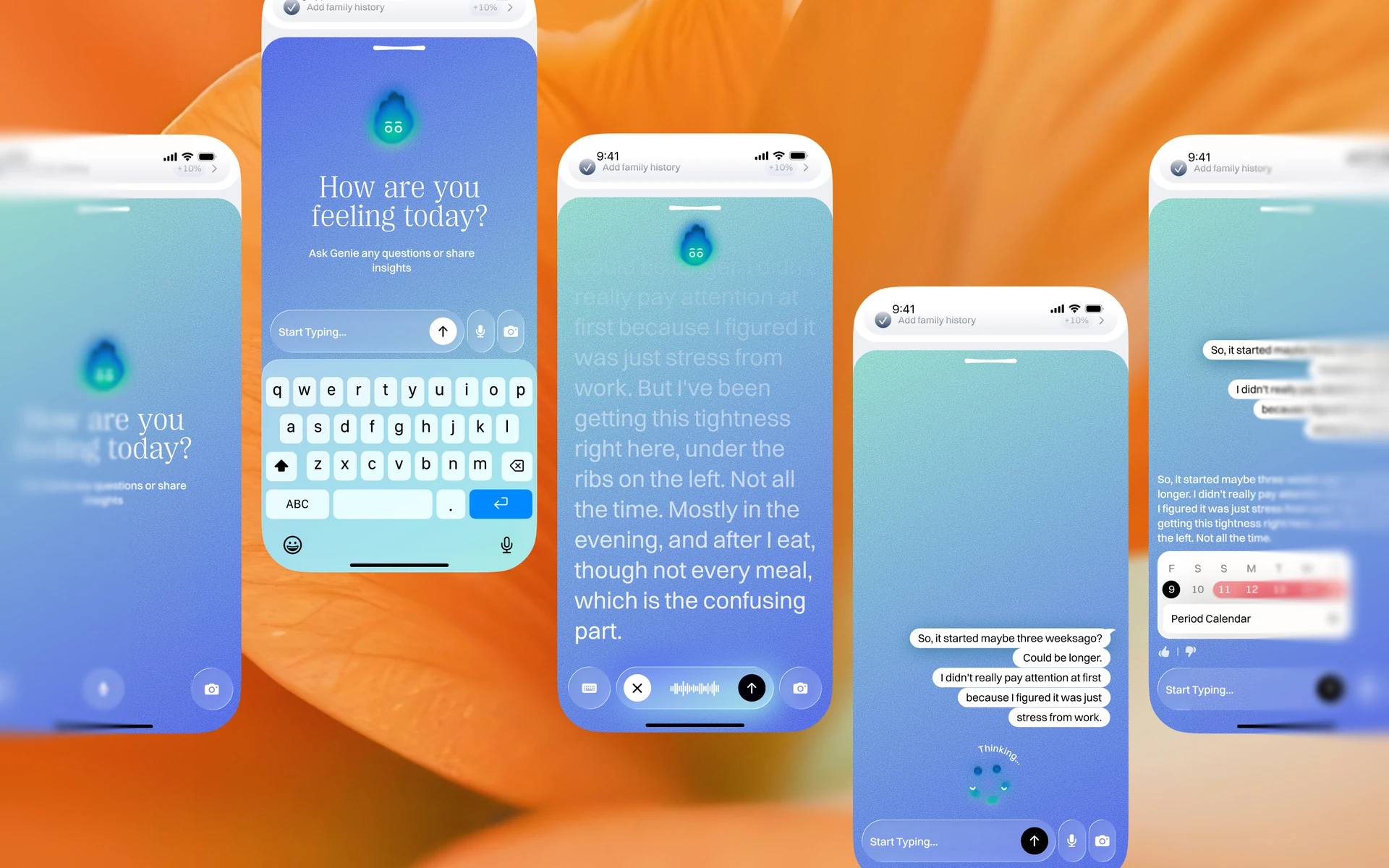
Genie's assistant started as an abstract sphere, the same glowing blob most AI products use. It had no link to health or to the name. We rebuilt it around fire.
Fire already carries the meanings a health guide needs. People talk about fire in someone's eyes when they mean energy, and a fire in the soul when they mean strength. Fire is the warmth of a living body. Healers used it as the first antiseptic, and stage magicians still use it to hold an audience. It also closes the loop with the name: in folklore, jinns are made of smokeless fire.
The flame gives the character a face and a range of moods. It nudges, reassures, rests and thinks, and each state changes its colour and shape using the same gradients as the rest of the brand. In the app, users interact with Genie directly, and it responds with the brand's motion and colour. We wanted that experience to feel pleasant without costing readability, so type, contrast and hierarchy follow the standards a healthcare product needs. The character went through the same check. The gradient flame loses its detail at small sizes, so we drew a simplified mini Genie: a flat shape with the same face that stays readable when small and holds strong contrast on any surface.
Brand identity and product design for Genie Health, Singapore.
Work with us — ding@denormalized.co
Next Case Study

Next Case Study
Next Case Study
Next Case Study
Next Case Study
Next Case Study

