Case Closed
2026
Brand Strategy
Logo & Identity
Typography
Character System
Art Direction
Website Design
Motion Design
Interaction Design
Generative Tool
Vibe
Senior Digital Designer
Sam Tipikin
Senior Brand Designer
Roman Myronov
Client, Partner, Friend
Luminar Foundation
Luminar is a foundation with one aim: helping older people age with dignity.
Luminar Foundation: Charity Branding & Website Design
[Problem]
[Solution]
The client came to us asking for a website. She was a volunteer – delivering food, sourcing clothes, organizing events and small outings for elderly people who needed someone to show up for them. It was real, hands-on work, just without any structure behind it. She wanted to grow it into a foundation.
So before any website work started, we began with branding – and a strategic session to figure out what this foundation was actually built on. What we found was an idea close to karmic investment, though we never wanted to spell it out that plainly in the brand itself. The premise: young people supporting this foundation aren’t just helping elderly people today. They’re also, in a sense, investing in their own future – caring for the kind of old age they’ll one day have.
Out of the strategy session came the central metaphor: the prism.
A single beam of light – one donation, one act of care – passes through the foundation like light through a prism, and comes out the other side not as one thing, but dispersed into many: a Prism of Care, a Prism of Warmth, a Prism of Kindness. What went in as a single act comes out multiplied, reaching further than the person who gave it could have reached alone.
But the prism wasn’t only about breadth – it was about time. Think of your life as a path moving forward. That path passes through a kind of prism of time, and just like light, it can bend – its direction shifts depending on what passes through it. What you do in the present is what bends that path. Do something good now, and the probability that your own destination bends toward something good increases too.
That’s the idea the whole brand sits on: what you put in today doesn’t just help someone else – it bends where you end up.
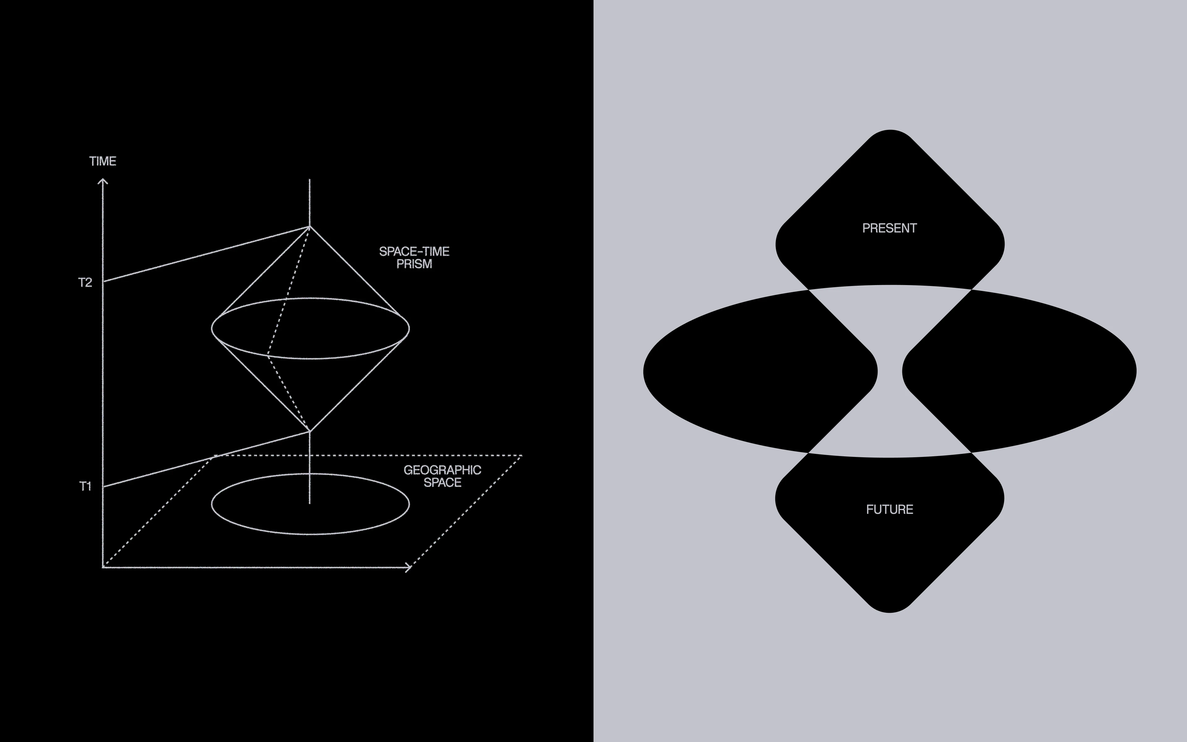
The logo reinterprets the time-prism shape and mechanic directly: two squares – present and future – are connected and form hourglass shape, passing through a space between them. That negative space shows refraction.
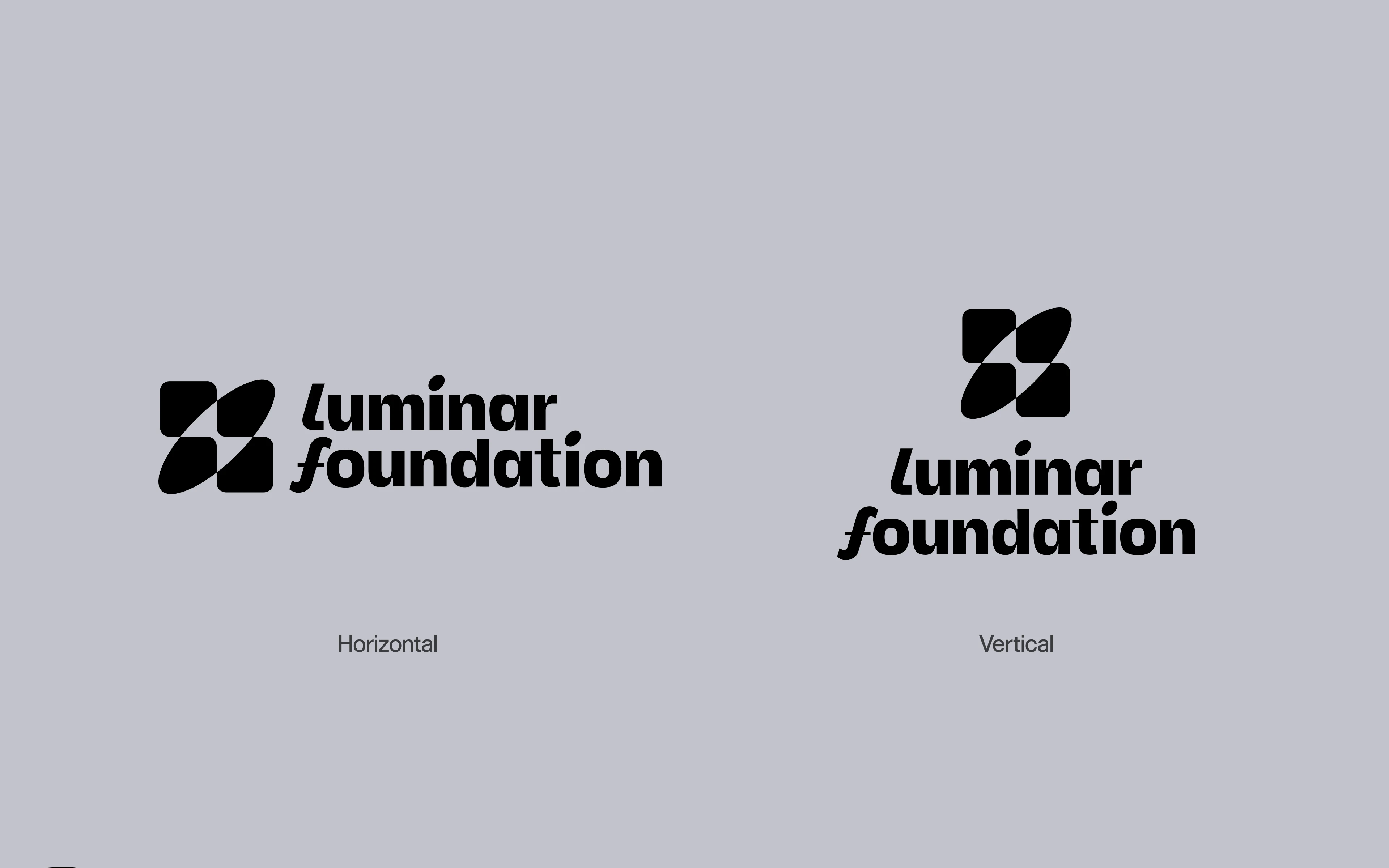
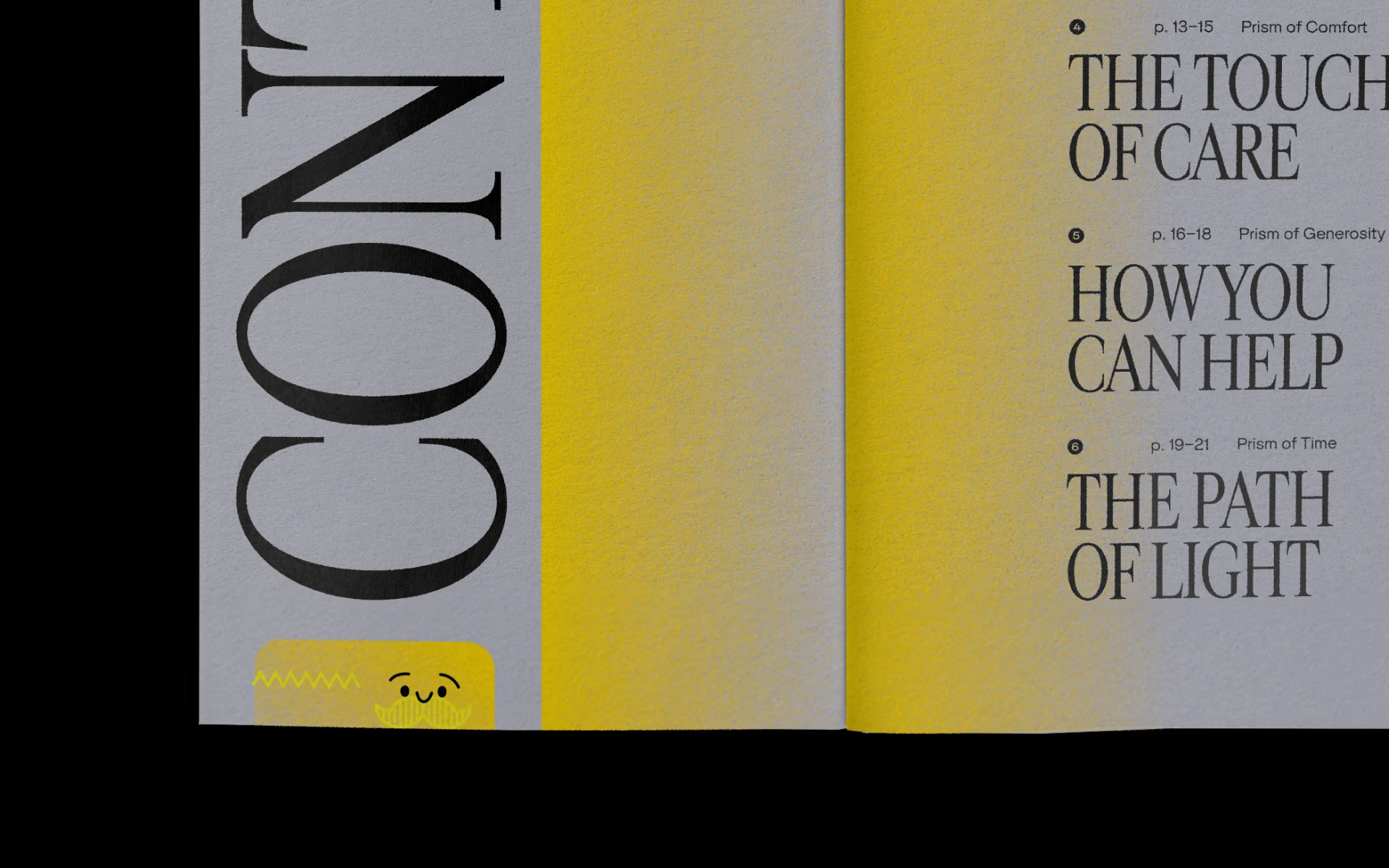
For the logo type, we chose Margo + Beuys – slightly playful, for two reasons: older people can be surprisingly childlike, and the brand speaks to a mid-aged audience. We wanted the foundation to feel cozy and trustworthy, not corporate.
That decision came from a category audit. Most existing eldercare foundations use the same visual language – heart-and-hand icons, muted blues and greens, imagery that frames aging as decline, something to be managed or prepared for. Luminar says the opposite: aging can be full of light, warmth, and life – sometimes even fun.
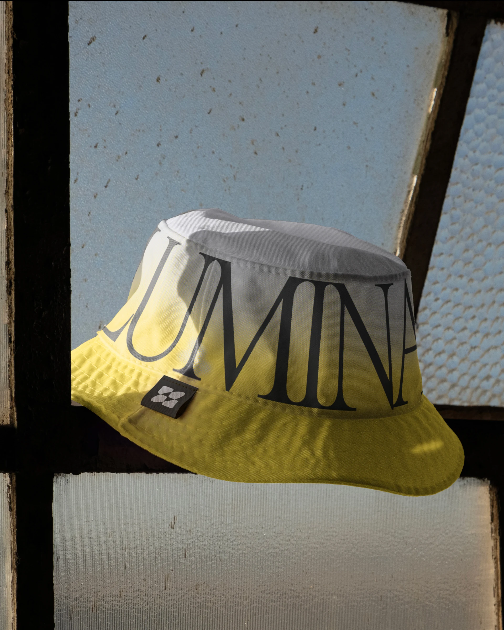
We picked Cardinal Fruit, an elegant serif, to balance out logo font choice and overall visual language, bringing in the serious, credible side of the foundation’s work.
[Slogan]
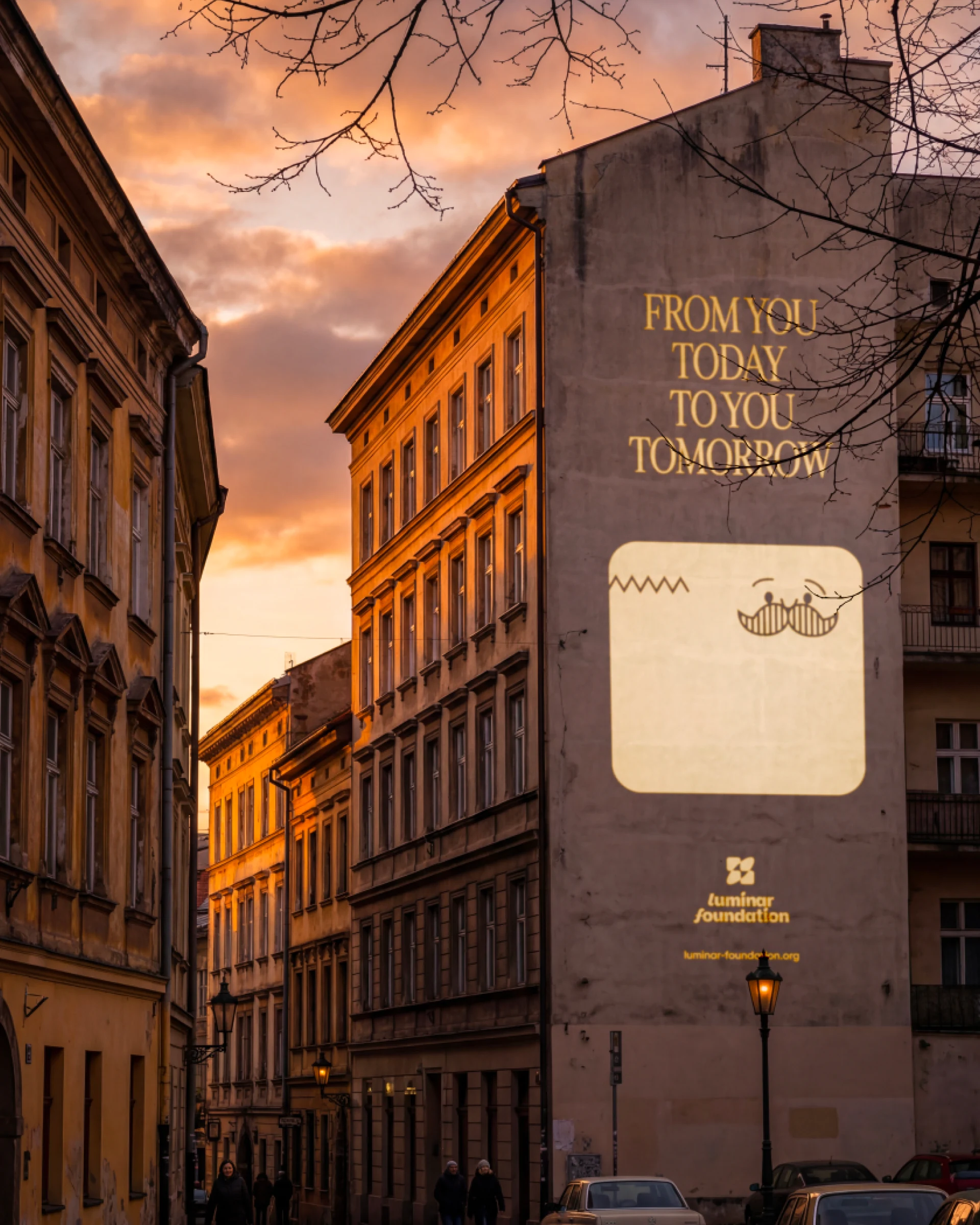
From you today. To you tomorrow.
The slogan captures the brand idea in a short, creative form.
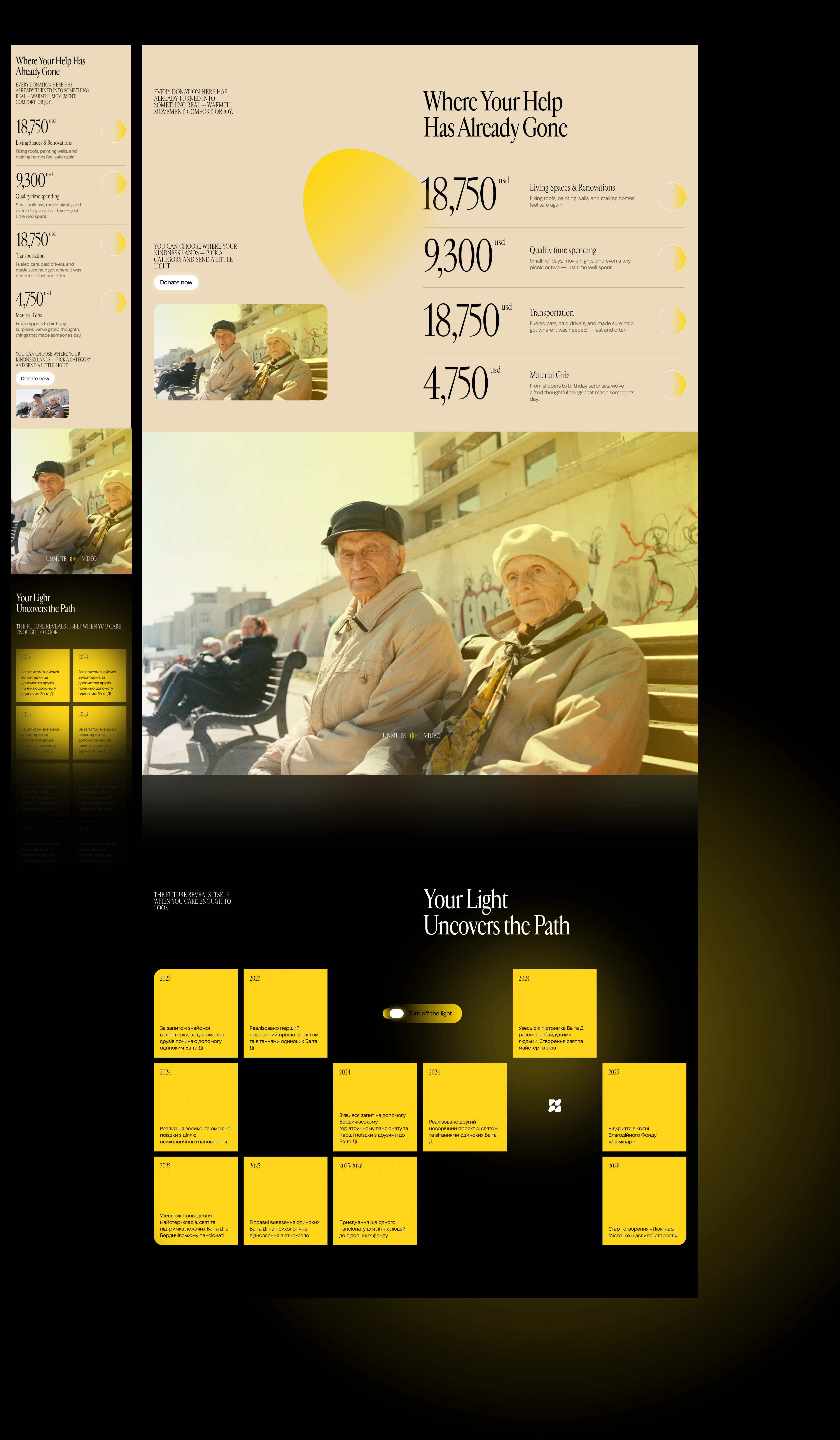
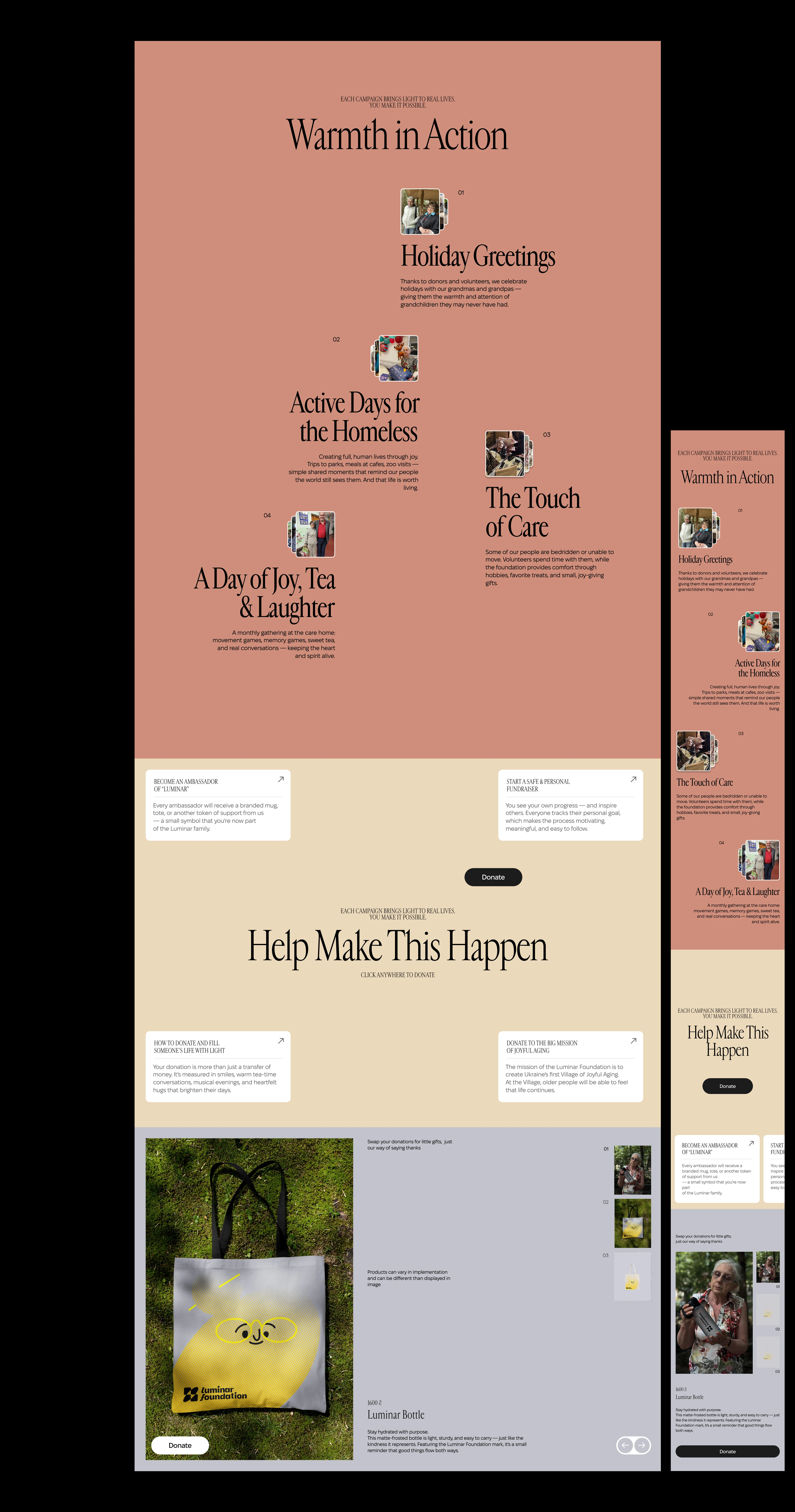
Light was the brief — the primary interaction layer. Most decisions about motion on the Luminar website traced back to a single question: how does light move through this? It follows the cursor, collects around elements, occasionally reveals content that sat hidden until you got close. The reveals feel earned. You moved there, the light responded.
The warmth is hard to pin on any single component. It works because the brand itself pushed through into every interaction.
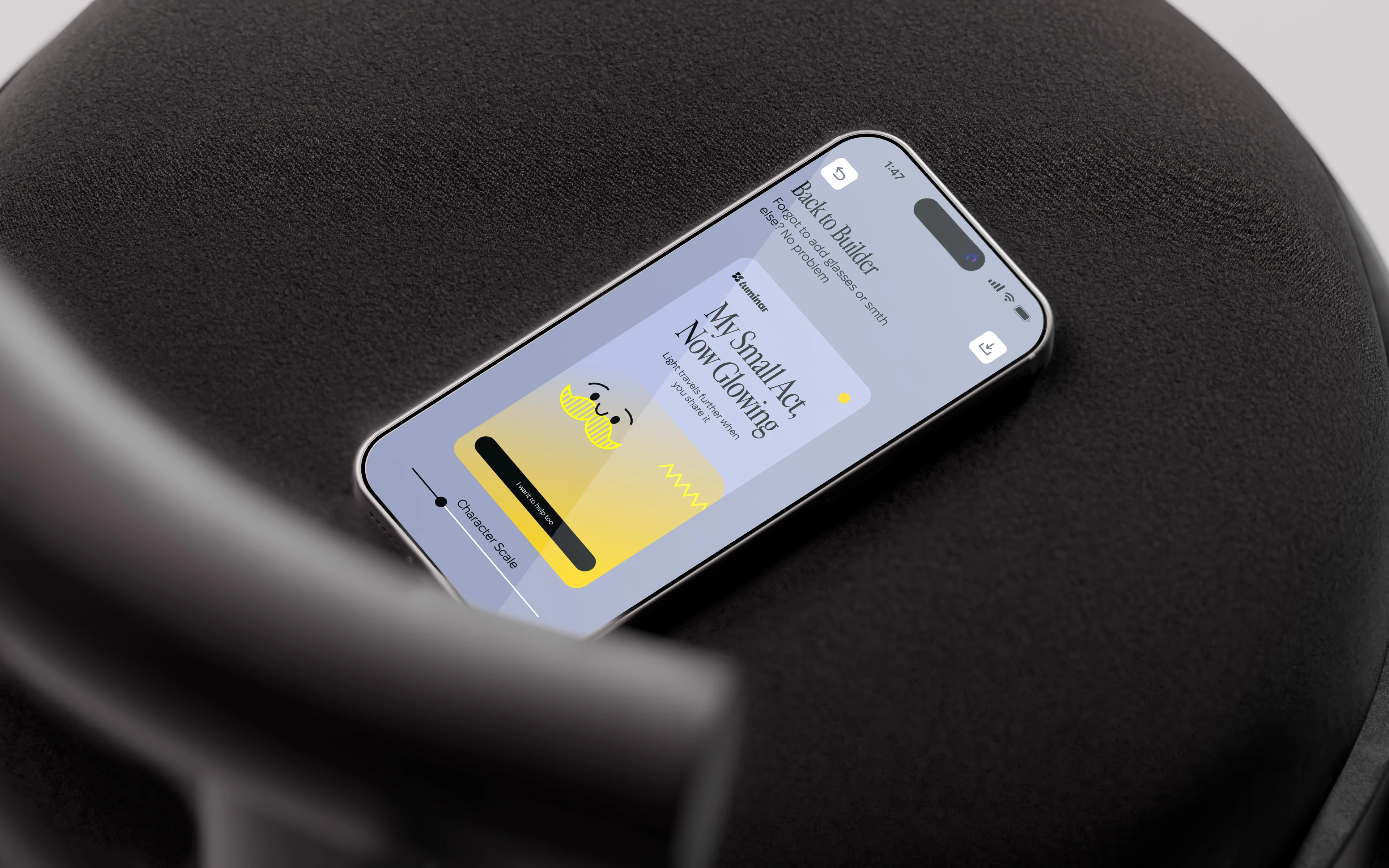
The ellipses and rectangles from the logo became the basis of a broader visual language, and one derivative of that was a small cast of grandparent-like characters – a way to represent the foundation’s actual work more explicitly, and to create emotional connection wherever that connection is needed.
At touchpoints where we wanted the brand to feel more corporate and serious, we dropped the faces entirely and worked with the yellow gradients and same shapes on their own – a more minimalistic, restrained solution for those moments.
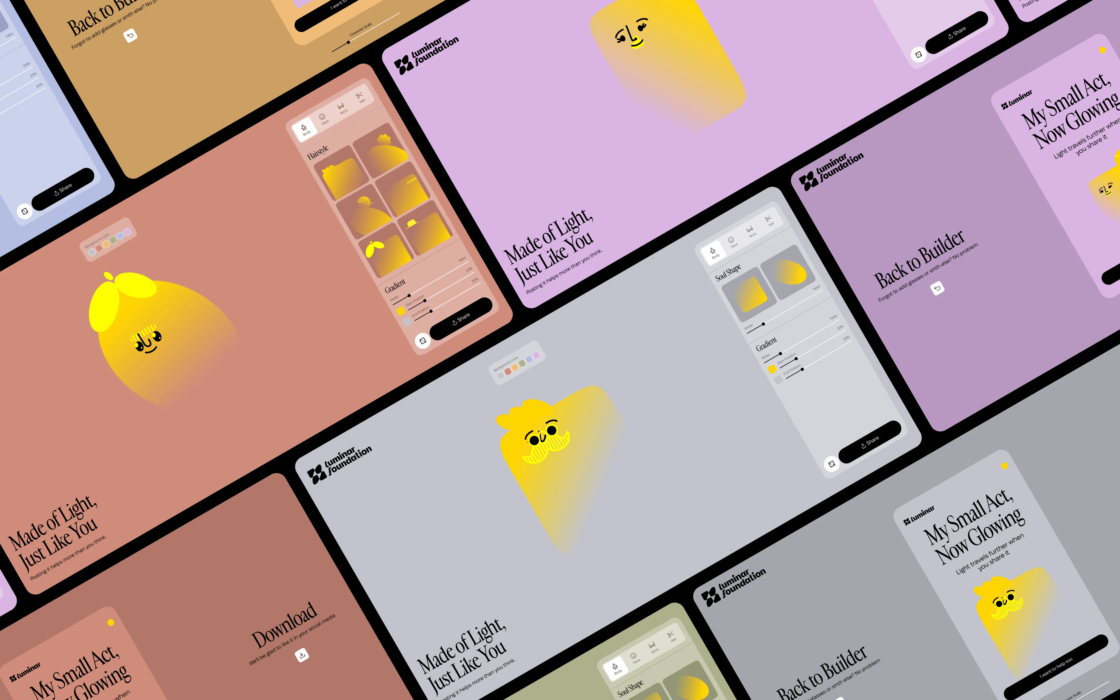
To make the visual language easier to work with – and to give it a wider range of use – we built a generative tool for creating these characters. It also let us add a game-like layer to the brand: a way to bring in more audience involvement and make the whole experience feel less transactional.
The aim was to make the donation process itself more entertaining, and to give people a reason to share their own generated character – spreading the brand along with it.
Next Case Study


Next Case Study
Next Case Study
Next Case Study
Next Case Study
Next Case Study

